


The "Swivel-Chair" Productivity Killer
You have successfully democratized data. Your teams have access to Tableau for visual analytics, Power BI for operational reporting, and perhaps a legacy layer of Qlik, Cognos, or SAP. But instead of empowering users, this abundance has created a new form of friction: Dashboard Fatigue.
Users are overwhelmed and to get a complete view of the business, a sales executive might have to log in to Salesforce for pipeline data, swivel to Tableau for regional visualizations, and then hunt through SharePoint for a Word doc or PDF strategy memo. This "swivel-chair" experience is a productivity killer that compounds with every additional BI tool you add to your stack.
According to Gartner, 47% of digital workers struggle to find the information or data needed to effectively perform their jobs. The same research found that knowledge workers now use an average of 11 applications daily - nearly double the six applications typical in 2019. This report sprawl is inconvenient, and measurable productivity loss.
When finding data is harder than using it, adoption plummets. Users stop logging in. They revert to emailing their favorite analyst for a static export, and your expensive BI investment becomes shelfware.
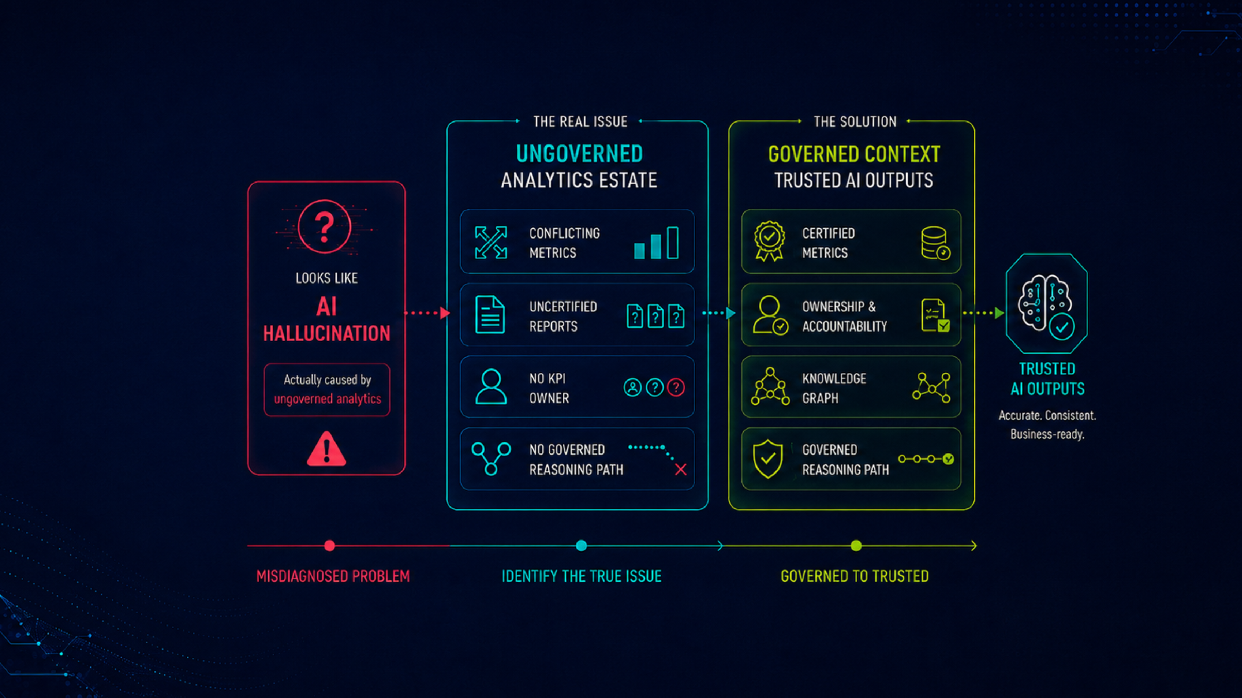
The Problem: The "Large Repository" Fallacy
The root cause of low adoption is not usually the quality of the dashboard; it's the analytics consumption experience of the delivery mechanism.
Contrary to the intent, most BI platforms get optimized for authors, not consumers. They organize content in technical hierarchies or massive lists. This logic makes sense to the data engineer who built it, but it is a maze for the business user who just wants "My Weekly Numbers."
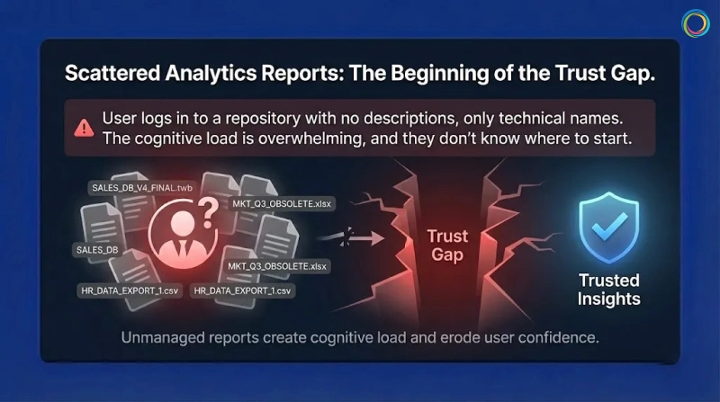
When a user logs in and encounters a large repository of reports with no descriptions or context, just the technical name of the dashboard, they experience cognitive load. They don't know where to even start.
This is where the trust gap begins. When users cannot easily find certified, validated bi dashboards, they lose confidence in the entire analytics ecosystem. The problem isn't data quality - it's the delivery layer creating friction between users and insights.
The Solution: A "Netflix-Style" Analytics Experience
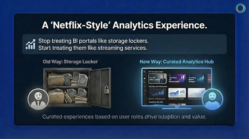
If we want analytics adoption to grow, we have to stop treating BI portals like storage lockers and start treating them like streaming services.
Netflix doesn’t dump every movie in front of you when you log in - and analytics shouldn't either. The experience should be curated based on the user’s role.
That’s how self-service analytics moves from “hunt and search” to “discover and consume.”
1. The Unified "One Stop" Shop
First, eliminate the swivel chair. A Unified Analytics Hub aggregates metadata from all your systems - Tableau, Power BI, Qlik, Excel—into a single interface.
A user searches for 'Gross Margin' and sees the certified and approved Tableau dashboard and the related PDF commentary side-by-side. No more hopping between tabs.
By bringing all analytics assets into one searchable interface, you reduce thecost of zombie reports by making existing content discoverable before users request duplicates.
2. Curated Portal Pages
Move away from complex navigation. Use Portal Pages to create role-based landing zones.
The Strategy: An executive logging in should see a curated page featuring their 'Top 5 KPIs,' a 'Quarterly Forecast' widget, and a news feed of recent analyst commentary.
The Benefit: The user sees only what matters to them immediately. This reduces noise and guides attention to the highest-value assets.
3. Smart Recommendations
Leverage usage data to drive discovery.
The Strategy: Show users 'Trending' reports or 'Recommended for You' based on what their peers in the Finance department are viewing.
The Benefit: This passive discovery helps users find insights they didn't even know they were looking for, keeping them engaged with the platform.
Brown-Forman, the global company behind brands like Jack Daniel's and Woodford Reserve, faced a classic case of fragmentation, not just of reports and dashboards but also of multiple portals. Their landscape included multiple portals, each housing SAP, Tableau, Salesforce, and Google Sheets, leading to a disconnected experience that hindered decision-making.
They didn't want just another tool; they needed a 'One-Stop Shop' to glue their ecosystem together. They deployed the ZenOptics Analytics Hub to unify access. Instead of forcing users to remember five different logins, they provided a Single Point of Access for all analytics assets.
Brown-Forman achieved a 27% increase in user adoption of their analytics tools year over year by simplifying the "last mile" of analytics delivery. With 4,000+ users now unified under a single platform, teams focus on analysis rather than retrieval.
ZenOptics has helped us solve our distributed reporting challenges and improve collaboration throughout our organization.
- Sam Sorsa, Senior Director of Finance, Brown-Forman
To make users love your data, you have to respect their time. No executive wants to wrestle with complex source systems or multiple logins.
Studies show knowledge workers lose at least 2 to 3 hours each week searching for information. Personalized analytics discovery goes straight after this waste.
When you unify tools and curate the experience around the user, your BI platform becomes a menu, not a maze - eliminating friction and unlocking the full ROI of your data investment.
Published January 21, 2026